Leo Bank
Child & Teen Cards
Overview
The feature enables parents to assign tasks, control rewards, and monitor spending in a simple and intuitive way. The user audience of this app is children aged 6–17.
The Challenge
Parents needed control and transparency, while children needed motivation and autonomy. Many parents were not confident using complex digital tools.
The Solution
A task-based system combined with clear tooltips, reward flexibility, and simple status indicators. The experience was designed to be understandable for both parents and children.
Key Results
1.
Parents gained confidence and control over their children’s finances.
2.
Children learned responsibility through real-life tasks and rewards.
3.
The feature supports financial literacy in a practical and engaging way.
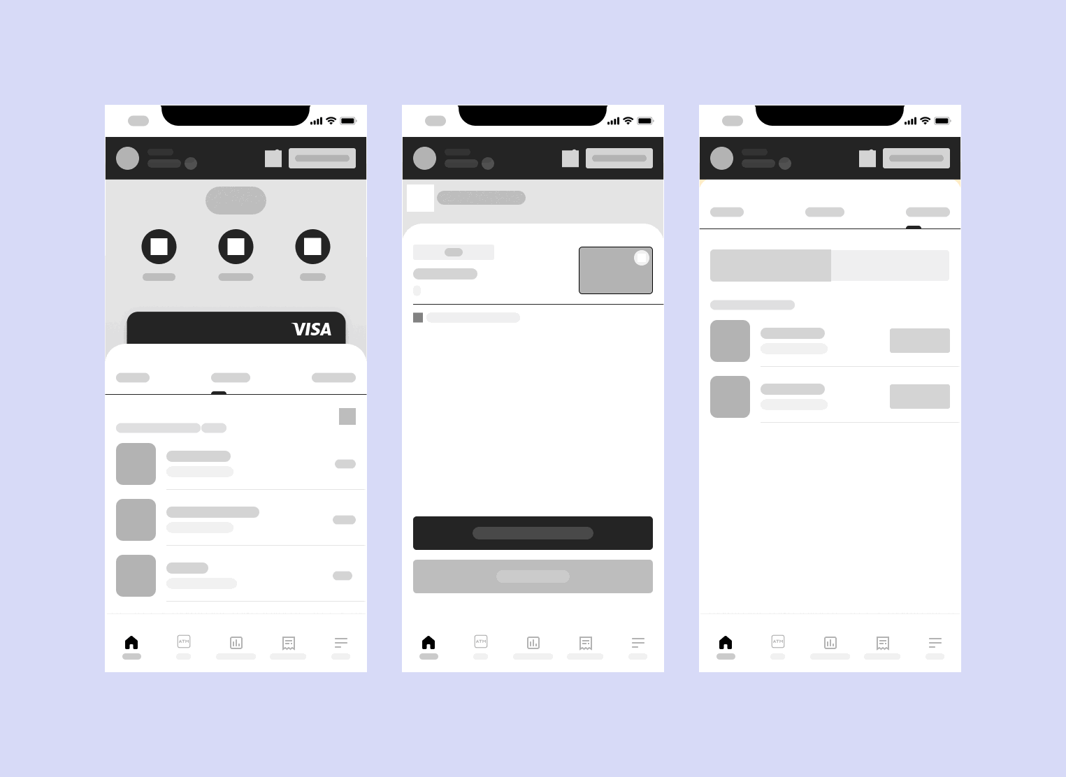
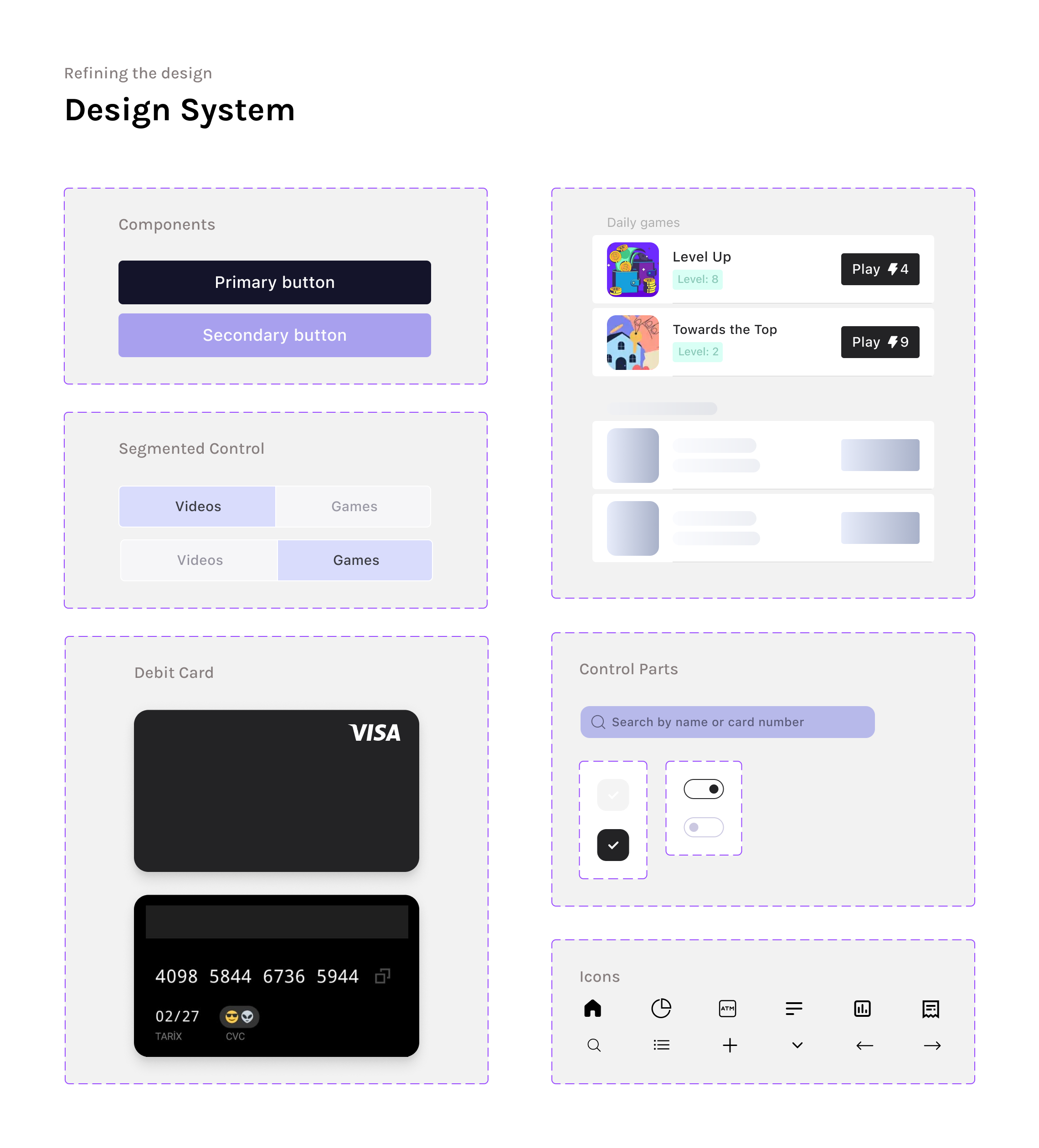
🚀 Lo-Fi to Hi-Fi Transformation
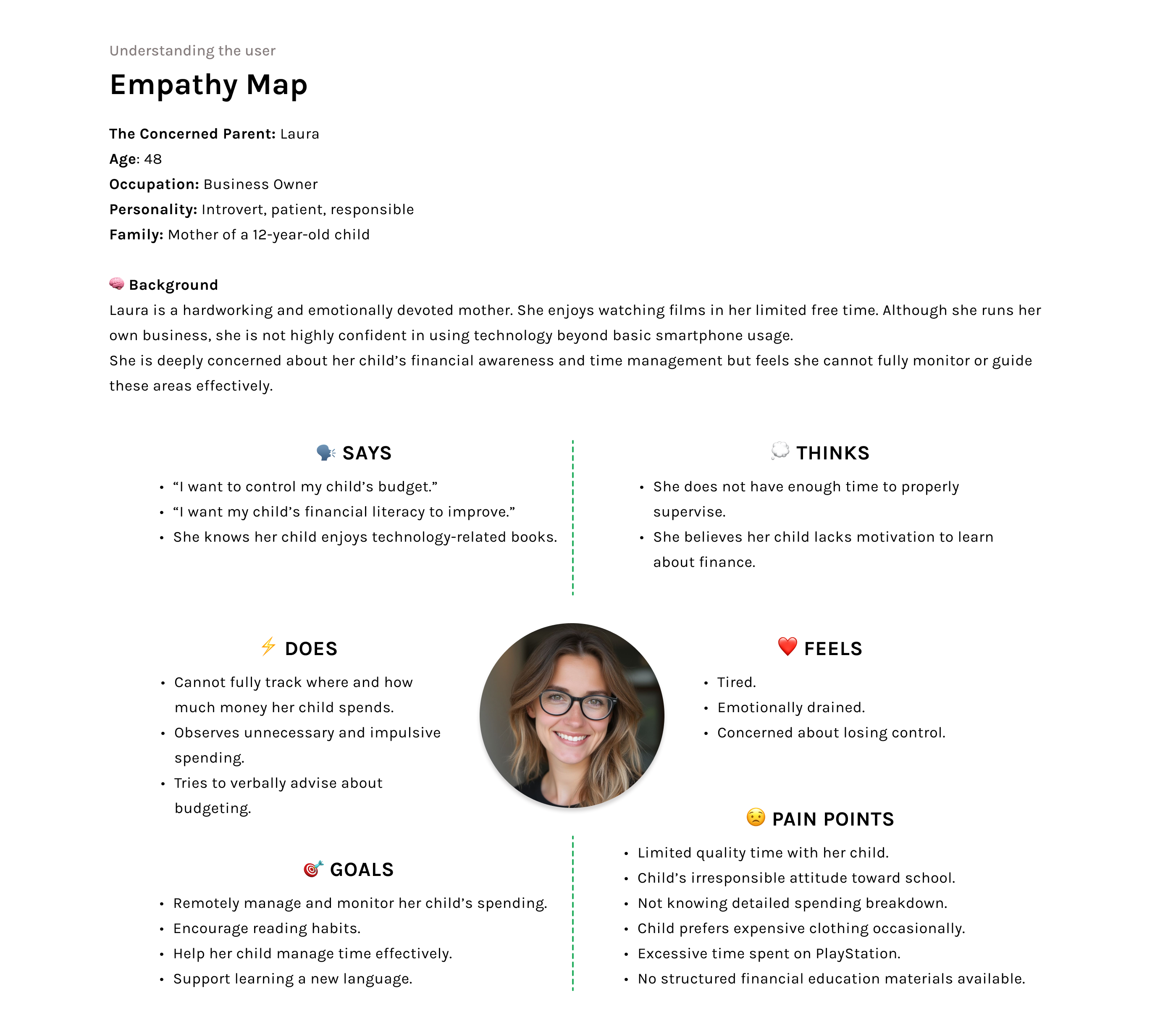
🔎 Research Methodology
To build a solid foundation for the product strategy, I conducted a combination of Primary Qualitative Research, Secondary Research, and Competitive Benchmarking.
1️⃣ Primary Qualitative Research
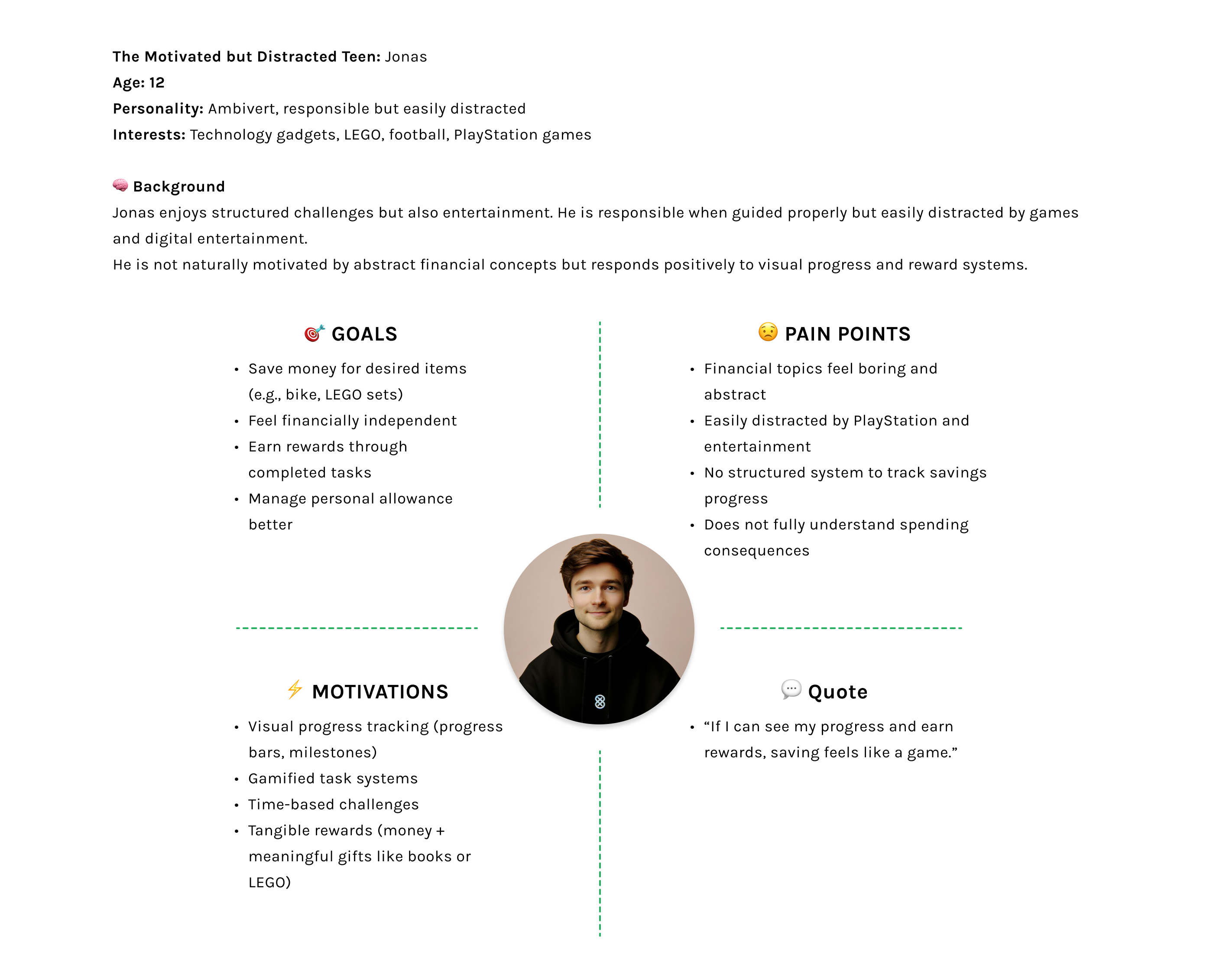
I conducted 6 in-depth interviews with teenagers (under 17) and their parents to understand financial behaviors, emotional triggers, and expectations within youth banking. Key insights included: - Parents’ concerns about uncontrolled digital spending - The need for transparency and real-time visibility - Teenagers’ preference for goal-based saving over traditional financial terminology - The importance of simplicity in core financial actions.
2️⃣ Secondary Research
I analyzed existing reports, market trends, and user feedback in the fintech space. Additionally, I reviewed YouTube user reviews of competing apps, extracting recurring pros and cons. This helped uncover usability gaps, unmet needs, and friction points within existing products.
3️⃣ Competitive Benchmarking & UX Gap Analysis
I performed a detailed competitive benchmarking of similar youth banking applications.
By analyzing:
- User reviews
- App store complaints
- Feature gaps
- Navigation friction points
I identified clear usability issues, particularly around ATM accessibility, spending control flexibility, and teenage motivation systems.
I also applied elements of a UX Heuristic Review, evaluating competitor flows against usability best practices.
Application View
"Research Insight (Empathy Map Result)"
Most parents were not highly familiar with digital banking tools. They needed clear guidance and reassurance while using the app.
To reduce cognitive load, tooltips were introduced across key screens. Tooltips help parents understand features without overwhelming them.
Through tooltips, parents can:
-See whether their child has completed assigned tasks
-Understand what each task involves
-Feel more confident using the feature
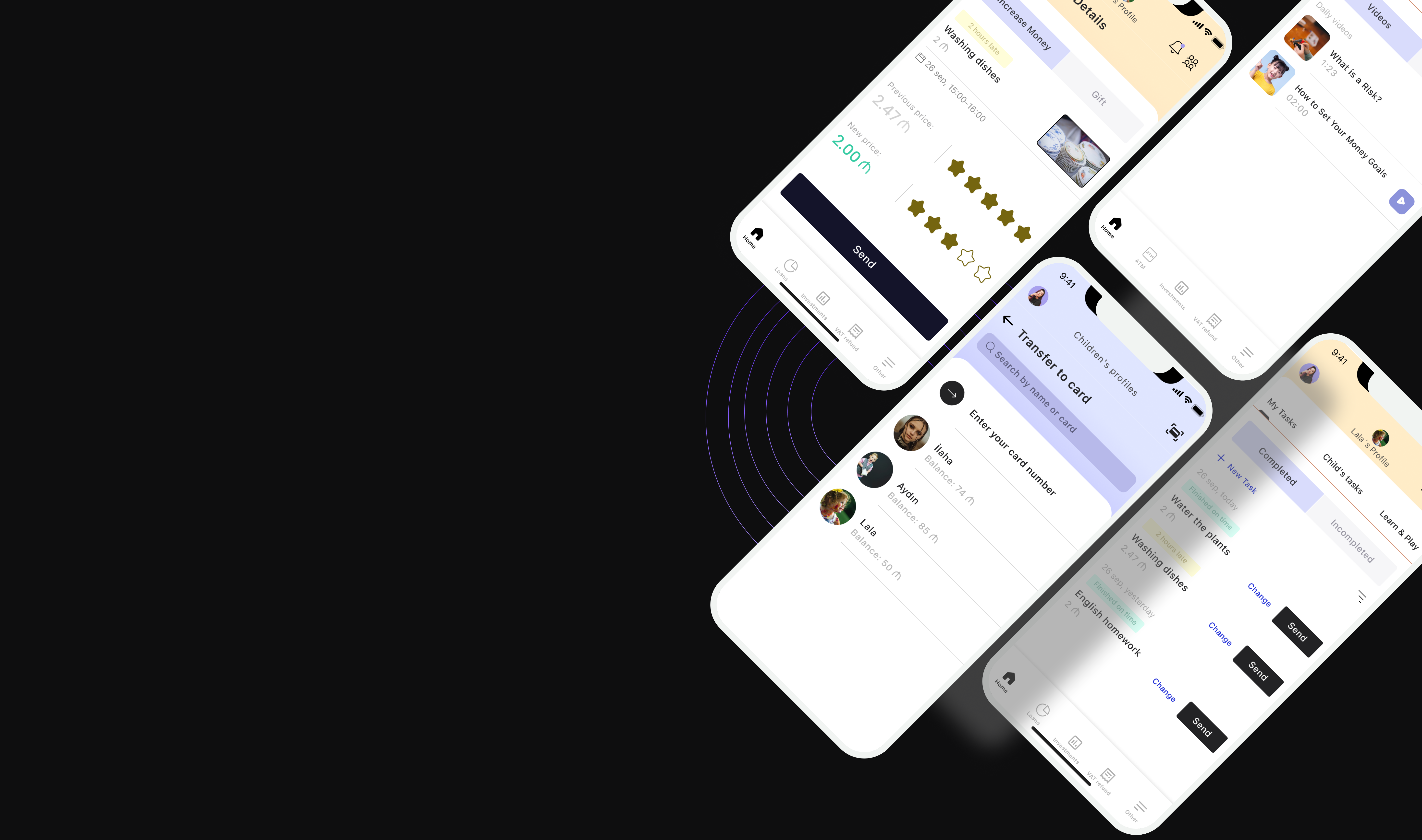
Alert – Payment for Task This alert informs the parent that a task has been completed and is ready for payment. It clearly shows: The task name The completion status The selected reward type (money or non-monetary reward) The alert helps parents make a quick decision without leaving the main flow. Reward Page This page allows parents to manage and assign non-monetary rewards. Parents can: Choose a reward (e.g. book, gift, experience) Name and save the reward for the child Change or update the reward at any time This supports motivation beyond financial incentives. Money Page This page allows parents to send money as a reward for a completed task. Parents can: Select an amount Review the task details Confirm the transfer to the child’s card Clear confirmation states ensure transparency and trust. View project: https://finance-kids-app.preview.emergentagent.com/
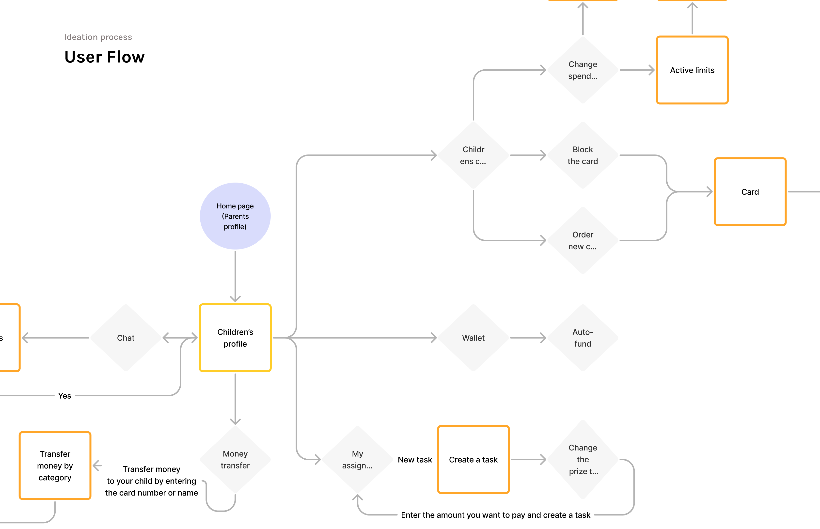
Feature Exploration-Children’s profile (Chat, Money transfer, Tasks)
I conducted a benchmark analysis for the project, and as a result, I created a shared monthly budget section for both parents to allocate money for their children. In the BusyKid app, the wallet could be managed by only one parent, which users often complained about. Based on this feedback, I introduced a “Shared Parent Budget” feature, allowing both parents to access and manage the budget together. This way, parents can clearly see how much money they allocate to their children on a monthly basis.Parents can activate or deactivate their children’s cards and set spending limits on their expenses.Just like in the Greenlight app, in my app parents can choose, by category, where their children can spend money. For example, categories can include restaurants and cafés or online shopping, because the child user audience is aged 6–17.
🚀 Smart Parental Control System
I designed a flexible parental control system that gives families real-time financial visibility and control. Parents can: Instantly activate, deactivate, or block their child’s card Order a replacement card directly within the app Set category-based spending limits Restrict specific merchant categories such as alcohol or online gaming Control and limit ATM withdrawals During my UX research, I discovered that many parents were concerned about uncontrolled digital spending and unnecessary purchases. To address this, I created a customizable spending management interface that allows parents to proactively decide where and how money can be spent. This solution balances independence and safety — empowering children while maintaining trust and financial responsibility.
Streamlined payment experience
🎯 Goal-Driven Child Experience
I designed the child dashboard to encourage independence, motivation, and financial awareness.
Children can:
Create personal tasks
Set savings goals (e.g., saving for a new bicycle)
Allocate money toward their goals
Track their progress in a simple and visual way
While benchmarking competitors, I identified a recurring usability issue: children struggled to locate nearby ATMs within similar apps.
To eliminate this friction, I integrated the ATM section directly into the main navigation bar, making essential actions immediately accessible.
This design decision improved usability and streamlined the overall user journey.
Next Project
Emerald — Real Estate CRM System B2B SaaS Product Design